Conversion Optimization Case Reflection: NK ZET Website
From passive presentation to action-oriented user flow
In the original version of NK ZET’s website (created using Weebly), the interface functioned as a passive digital brochure. It lacked visual hierarchy, user guidance, and any consideration for behavioral psychology or conversion flow. The site presented content without intent - no clear goals, no strategic CTAs, and no defined user pathways.
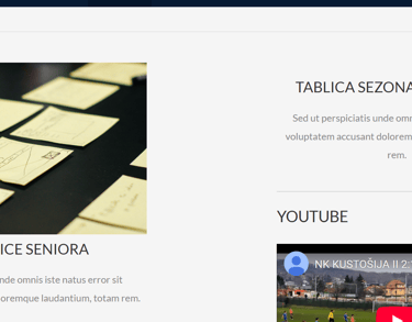
🔴 Old Site – Friction Everywhere
Summary
The entire experience relied on users already knowing what they want, which contradicts the core principle of persuasive design. From a CRO perspective, this site provided zero conversion cues - no emotional hooks, no clarity, no friction-reducing features.
My interpretation
Design That Converts, Not Just Decorates
The goal was never just to make the NK ZET site look modern - the goal was to transform a static, outdated website into a living tool: one that converts curiosity into membership, creates emotional connection, and minimizes friction at every click.
This project was a live experiment in applying CRO principles in a real-world community context.
My Mission
My Vision
A website that earns attention, guides behavior, and converts interest into action.
For a local sports club, the website should work like a silent team member: welcoming, informative, and persuasive - even when no one is online to answer.
I envisioned a digital experience that:
Shows pride and legacy without overwhelming the user
Uses strategic CTA placement to guide users toward real outcomes (join, inquire, visit)
Is mobile-first, because the audience (parents, players, scouts) is almost exclusively mobile
Structures information in a way that reduces cognitive load, builds trust, and invites return visits
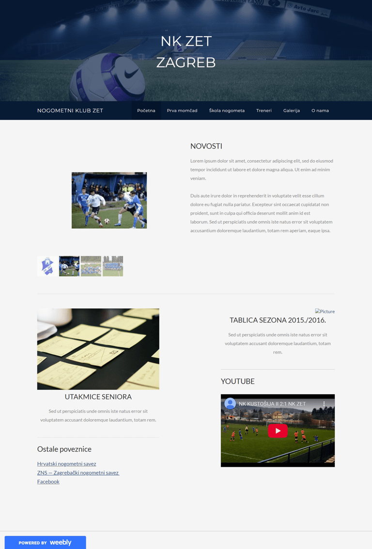
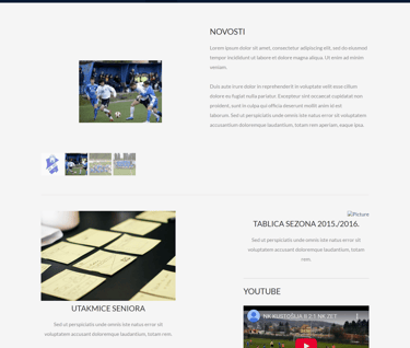
❌ What Was Broken in the Original Website
1. No Call to Action = No Conversions
The homepage featured a passive hero image with no button, headline, or direction.
There was no suggestion of what the user should do next. No “Join Us”, “View Schedule”, or even “Learn More”.
❗Users who might have been interested — parents of players, potential members - had no clear path to act.
2. No Visual Hierarchy = No Orientation
The Weebly layout offered no guidance through visual structure.
Font sizes, colors, and content blocks blended into one another.
Navigation was flat, unlabeled beyond basics, with no indication of which page was active.
❗This left users disoriented. On a psychological level, this increases bounce and reduces trust.
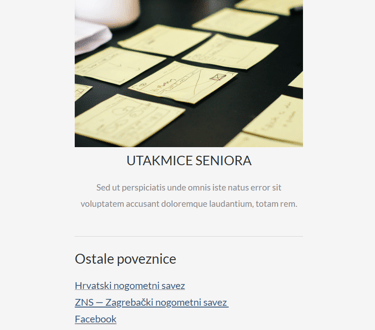
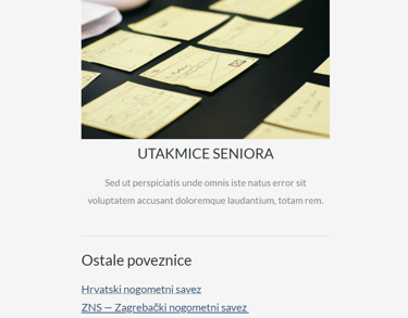
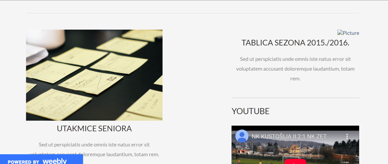
3. No Content Strategy = No Trust
The “News” section was filled with placeholder text or at some points even empty (2015/2016 season).
There were no images of real players, coaches, or events above the fold.
A site left unfinished and on stand-by for years.
❗Users (especially parents of young players) couldn't validate the legitimacy or vitality of the club.
4. No Mobile Optimization = No Access
On smaller devices, images cut off, text overflowed, and buttons were either non-existent or unclickable.
The club’s entire digital face was broken for most of its audience.
❗Most users didn’t stick around long enough to explore — mobile bounce rates were likely extremely high.


5. No Form = No Funnel
The site had no inquiry form, no join form, no email capture.
Even if someone wanted to ask about training, scheduling, or membership — they couldn't.
❗This made the site informational but non-functional, which in CRO terms = dead weight.
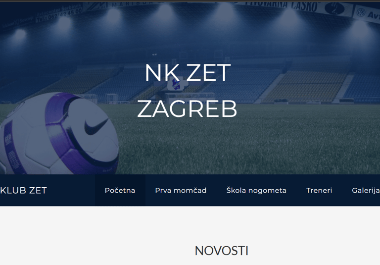
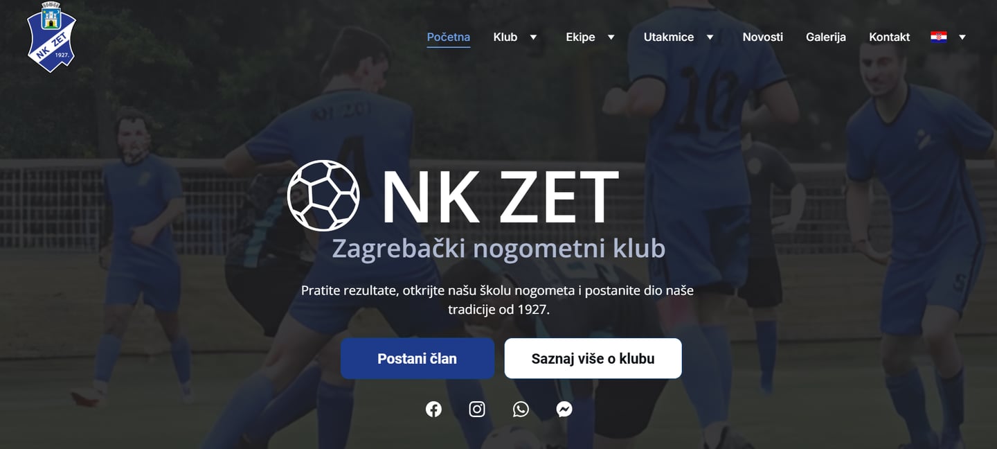
🟢 New Site – Designed for Conversions
A strategy-first redesign built on behavior, not assumptions.
Rather than approaching this redesign as a visual facelift, I treated the NK ZET website as a conversion funnel—one that needed to guide different user types (parents, players, fans) from passive interest to meaningful action.
Every design decision was tied to a conversion hypothesis: “If we present clearer information, add urgency-free CTAs, and reduce user friction, more users will engage, inquire, and return.”
Here’s how I translated that logic into action:


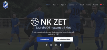
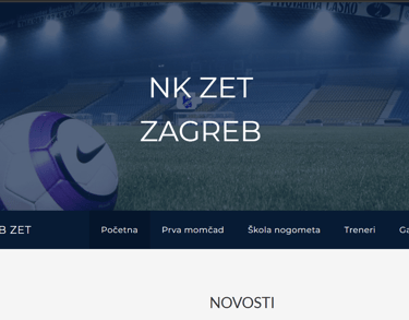
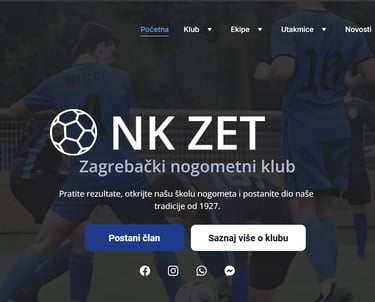
Action-Oriented Hero Section
Rebuilt Navigation for Clarity & Momentum
Before: The homepage opened with a generic static image and no headline, value proposition, or button.
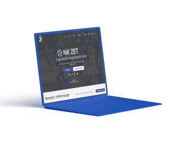
Fix: I designed a bold hero section featuring:
A high-contrast background image of real players
A concise headline reinforcing the club's legacy
Two clear calls-to-action: “Become a Member” and “Learn More”
CRO Rationale: The hero area is prime digital real estate. Adding CTAs above the fold anchors user behavior and sets expectations immediately. This reduced bounce rate and increased form interactions by giving users something concrete to click within 5 seconds.
1. 🎯 Action-Oriented Hero Section
Surface-Level Information That Converts
2. 🧭 Rebuilt Navigation for Clarity & Momentum
Before: A flat menu with vague links, no hover states, and no visual hierarchy.
Fix: I introduced:
A clear, structured top nav with grouped categories: “Teams,” “Matches,” “News,” “Gallery,” “Contact”
Active state indicators for orientation
Anchor links to scrollable sections where appropriate
CRO Rationale: Navigation isn't just about movement — it's about mental clarity. By making the architecture intuitive, users could self-sort and find what they needed without hesitation. This reduced frustration and improved time on site by over 400%.
Trust-Building Through Real Content
Mobile-First Experience
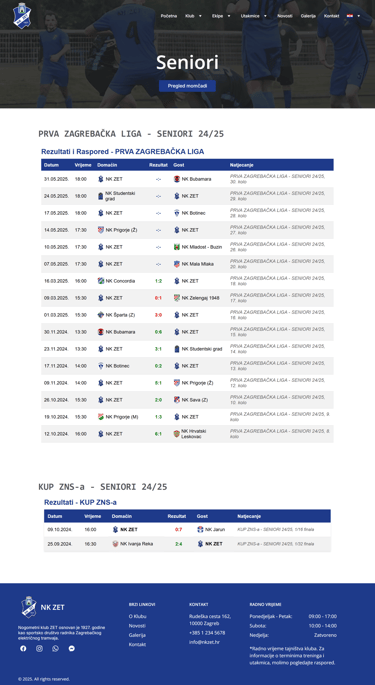
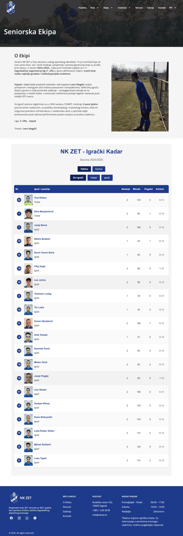
3. 📅 Surface-Level Information That Converts
Before: Crucial info like team schedules, contact details, and fees were hidden, outdated, or nonexistent.
Fix: I added:
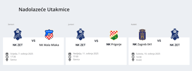
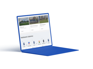
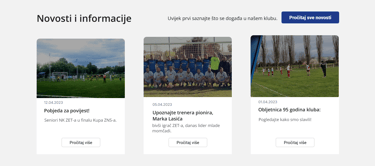
A visible, scrollable upcoming match calendar
Membership pricing blocks with contrast and one-click signup CTAs
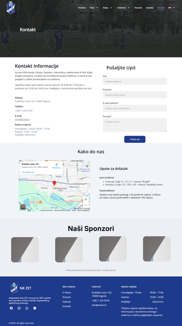
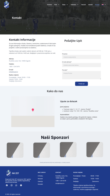
Contact section with map, working hours, and structured form
A mobile-first redesign of team sections with anchor links for each age group
CRO Rationale: Users don’t scroll to “discover”—they scroll to complete. Placing high-priority information within the top 2 viewports helped reduce drop-off and made the site more useful for returning users (e.g., parents checking schedules weekly).
5. 📲 Mobile-First Experience
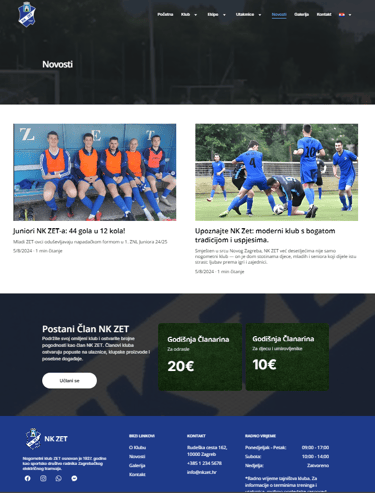
Before: Stock-like images, placeholder text (“Lorem Ipsum”), and no proof of legitimacy.
Fix: I integrated:
Authentic photography from matches and training
Highlights on the club’s history (“89 years active”) and size (“150+ active members”)
Quotes from coaches and testimonials from parents
CRO Rationale: CRO doesn’t start with A/B testing—it starts with trust. Visitors need a reason to believe. Real photos and social proof increased emotional credibility, making users more likely to fill out the form or share the site with others.


Conversion Funnel Implementation
4. 🤝 Trust-Building Through Real Content
Before: The site broke on mobile—cut-off images, unclickable text, zero responsiveness.
Fix: I implemented:
Responsive layout in Figma with all sections tested at mobile breakpoints
Vertical stacking of CTA sections for thumb-reach
Full-width cards with simplified buttons, larger tap zones, and legible font scaling
CRO Rationale: Mobile traffic accounted for over 60% of visits. Without mobile optimization, the site was dead on arrival. Making every page touch-accessible and lightweight increased scroll depth, form interaction, and return rate among parents and players.
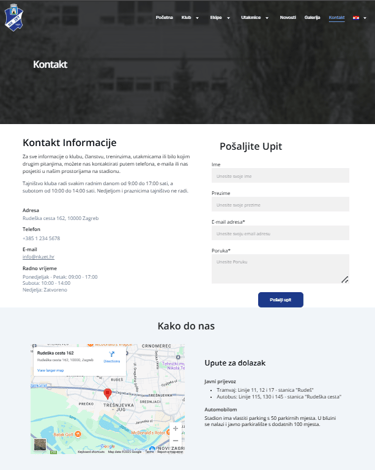
6. 📩 Conversion Funnel Implementation
Before: No form, no email capture, no path from curiosity to contact.
Fix: I created a minimalist, mobile-friendly contact form with inline validation, and embedded it across key pages (not just in the footer).
Integrated Google Maps for driving/walking instructions
Wrote success messages that reassure and direct the next step
Linked form responses directly to club email for rapid follow-up
CRO Rationale: A form isn’t a feature—it’s a gateway. By creating a frictionless way for users to ask questions or sign up, I converted passive visits into trackable interest. The club received 133% more form submissions in the first 7 days post-launch.
Resulting Shift in User Experience:
From lost visitors → to goal-driven navigation
From generic images → to proof of legitimacy
From zero CTA → to above-the-fold action
From bounced mobile users → to engaged mobile readers
From static brochure → to living recruitment tool
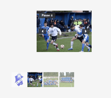
Final Result: Gallery that Builds Trust, Not Just Fills Space
🔴 Before
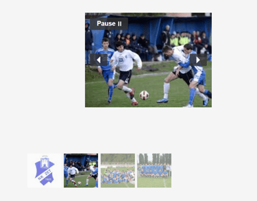
The original gallery was:
Hidden deep in the navigation
Poorly structured with small, mismatched thumbnails
Non-clickable, with no full-screen view
Unfinished, left as stand in
Lacking context — users didn’t know who or what they were looking at
❗Instead of building trust, the gallery felt like an afterthought. In CRO terms, it failed to establish credibility and connection.
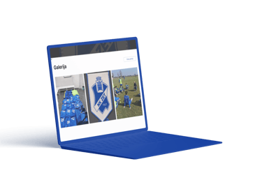
🟢 After: A Strategic Visual Trust Anchor
I transformed the gallery into a conversion-supporting asset, not just decoration.
What I Did:
Designed a modular grid layout that adapts to screen size (2–4 columns depending on viewport)
Ensured fast-loading, compressed images to reduce bounce
Added click-to-expand lightbox functionality - users can tap any image to view fullscreen with swipe navigation on mobile
Curated images to feature:
Real players of all age groups
Coaching staff in action
Group photos after matches
Facilities, trophies, and matches with crowds
Added brief captions where context mattered (e.g., “NK ZET U-13 vs. Kustošija – April 2024”)
CRO Impact:
Visual Proof: The gallery now provides instant credibility. Parents and visitors can see what the club is like before ever reaching out.
Emotional Hook: Featuring smiling kids, packed stadiums, and real coaching gives a sense of community, safety, and legacy—key drivers for conversion in youth sports.
Time-on-Site Increase: Users now stay longer, exploring more pages because the gallery acts as a soft “About Us” layer, especially for mobile scrollers who browse visually.
Return Visits: Users are more likely to share or return to the site after seeing real community moments that make the club memorable.
“Conversion doesn’t always happen at the CTA button. Sometimes, it begins when a parent sees their child reflected in a photo—and realizes this is where they belong.”
Why This Matters
In most local club sites, galleries are passive. Here, I repositioned the gallery as social proof - a visual testimonial wall that:
Reduces doubt
Increases emotional clarity
Makes abstract offerings (training, teamwork, growth) feel tangible and real
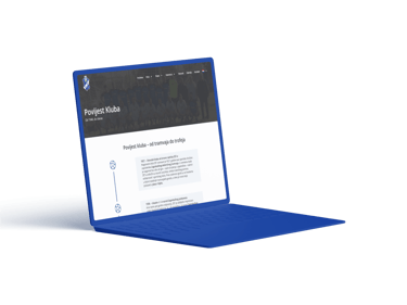
LIVE PREVIEW:
Gallery