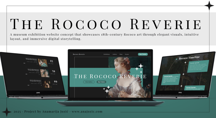
Case Study: Rococo Reverie – Exhibition Website Design

This project was created as part of a personal design study to explore how classical art movements can inform modern digital experiences. The full case study includes research insights, design rationale, and a complete layout breakdown.

Inspired by the ornate elegance and romantic spirit of Rococo art, I set out to reimagine how this historical style could live in a modern digital space.

Project Overview

Project Type: Personal Concept Study
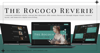
Title: Rococo Reverie – A Digital Portal into 18th-Century Rococo Art
Role: UX/UI Designer
Tools: Figma, Photoshop
Duration: ~2 Weeks

This project is a self-initiated exploration into how historical art movements (particularly Rococo) can be interpreted and expressed through modern digital interfaces. The goal was to design a fictional exhibition website that blends visual opulence with clarity, elegance, and usability.

Purpose of the Study

  • Translate the whimsical and ornate nature of Rococo into a digital format.

  • Create a smooth, scroll-driven layout for storytelling, exploration, and conversion.

  • Design a responsive and accessible site structure suitable for real-world implementation.

Research & Inspiration

I began with a deep visual and contextual study of the Rococo era:

  • Art by Fragonard, Boucher, Watteau, and Greuze.

  • Design motifs: pastels, florals, gilded accents, playful asymmetry, and romantic themes.

  • Competitive UX references: The Louvre, The Met, and The Getty online exhibitions.

This blend of classical research and digital inspiration guided both the layout structure and the UI aesthetic.

Layout & Site Architecture

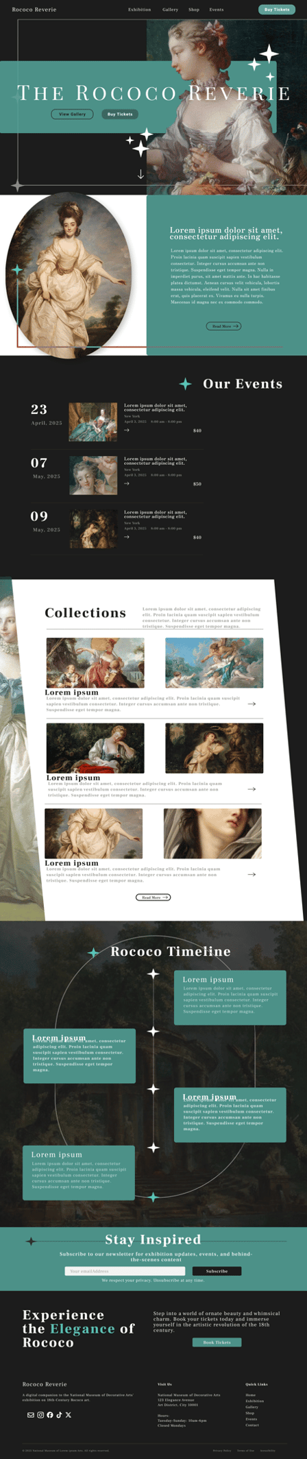
The design follows a vertical scroll narrative, leading the visitor from inspiration to action. Key sections include:
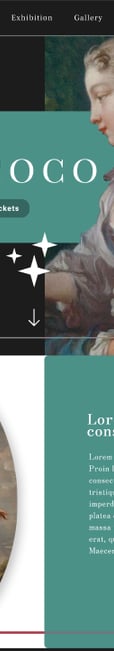
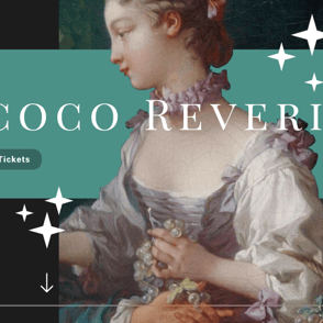
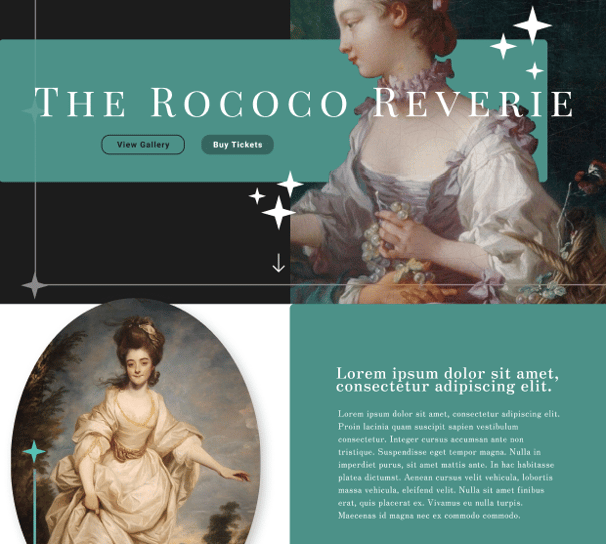
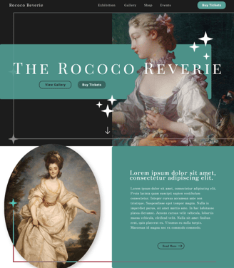
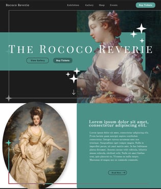
  1. Hero Section

    • Full-screen artwork + overlapping serif typography

    • Glittering star-like UI elements for decorative flair

    • Primary CTAs: “View Gallery” and “Buy Tickets”
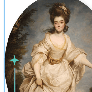
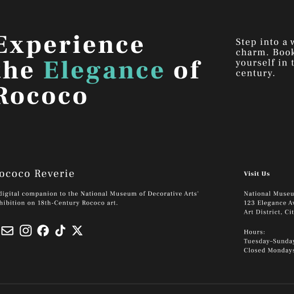
  2. Exhibition Intro

    • Text block with an oval-framed artwork to evoke classical portraiture

    • Scroll cue invites user further into the page
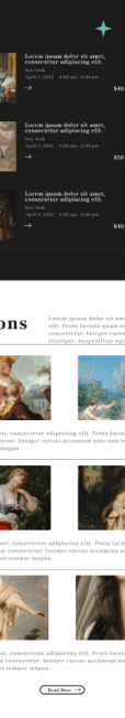
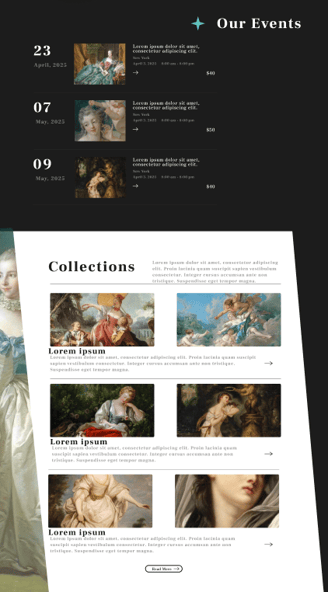
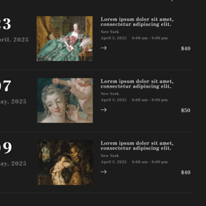
  3. Events Section

    • 3 upcoming event cards with dates, thumbnails, pricing, and short descriptions

    • Monochrome background to contrast with previous sections
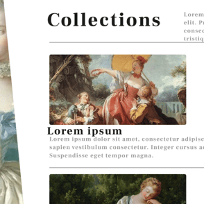
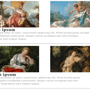
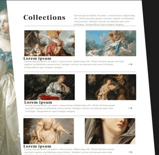
  4. Collections Section

    • 5 horizontally stacked art thumbnails with captions

    • Mix of portrait and landscape images to reflect the diversity of Rococo media

    • “Read More” CTAs on each tile
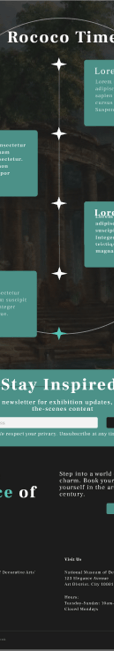
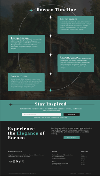
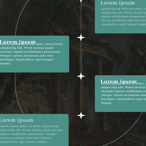
  5. Rococo Timeline

    • Vertical curved path with four floating informational blocks

    • Positioned against a scenic background painting for drama

    • Stars and thin lines guide the eye downwards

  6. Newsletter CTA

    • Horizontally laid form encouraging engagement

    • Strong but respectful privacy statement
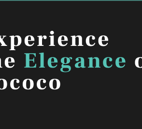
  7. Footer

    • Strong branding emphasis (“Experience the Elegance of Rococo”)

    • Address, social icons, navigation links, and legal disclaimers

Visual Language

Color Palette

  • Mint green and aqua blue accents evoke grace without overpowering

  • Ivory, black, and canvas beige provide contrast and elegance

  • Pops of white stars and highlights add visual rhythm

Typography

  • Header: Playfair Display – evokes literary and aristocratic beauty

  • Body: Modern sans-serif for clarity (likely Lato or Inter)

  • Text hierarchy is maintained with clear contrast and spacing

Iconography & Graphics

  • Starburst accents give the site a magical, celestial feel

  • Scroll lines and arrows hint at navigation intuitively

Responsive & Accessible Thinking

While this is a static concept, the design accounts for real-world application:

  • Clear button styles for easy tap targets

  • High contrast between background and text in most sections

  • Text containers and galleries are modular and easily stackable on mobile

  • Minimal use of distracting animations for calm UX

Reflections

This project was a deep dive into designing for emotion. I learned:

  • How to blend historical elegance with digital simplicity

  • The importance of whitespace in letting visual art breathe

  • That user guidance (arrows, scroll prompts) can be done subtly without breaking immersion

  • How type and composition can evoke timelessness, even in a modern site

Tools Used

  • Figma – UI design, wireframing, component layout

  • Photoshop – Cropping, art treatments, color balance on historical paintings

  • Notion & Miro: Planning, notes, structure, research collection.

Final Thoughts

Rococo Reverie is a celebration of elegance. Not just in art, but in digital storytelling. This personal study helped me sharpen my skills in aesthetic-driven UX, and showed how we can use the past to inspire future-facing design.

(Click to View)

Overview