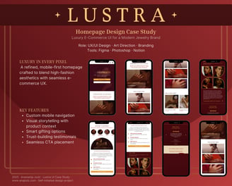
Lustra
Jewelry E-Commerce App
Modern, elegant jewelry e-commerce app that blends aesthetic beauty with functional UX
Project Overview
Type: Self-Initiated Concept Design
Role: UX/UI Designer
Duration: 6 Weeks
Tools: Figma, Adobe Photoshop, Notion
Skills Applied: UX Research, Visual Design, Responsive Layout, E-Commerce Flows, Mobile Design
Goal
To design a modern, elegant jewelry e-commerce app that blends aesthetic beauty with functional UX, tailored to users shopping for timeless pieces—whether for themselves or as meaningful gifts. The project aimed to simulate a real-world retail experience through a mobile-first, story-driven interface that celebrates product craftsmanship while encouraging conversion.
Inspiration
Jewelry shopping is often emotional, symbolic, and highly personal. I wanted to create an app that reflected that experience—not just a store, but a curated, luxurious space for browsing, gifting, and connecting with craftsmanship. This project combines high-end retail UI with thoughtful UX strategies to simplify decision-making while elevating brand trust.
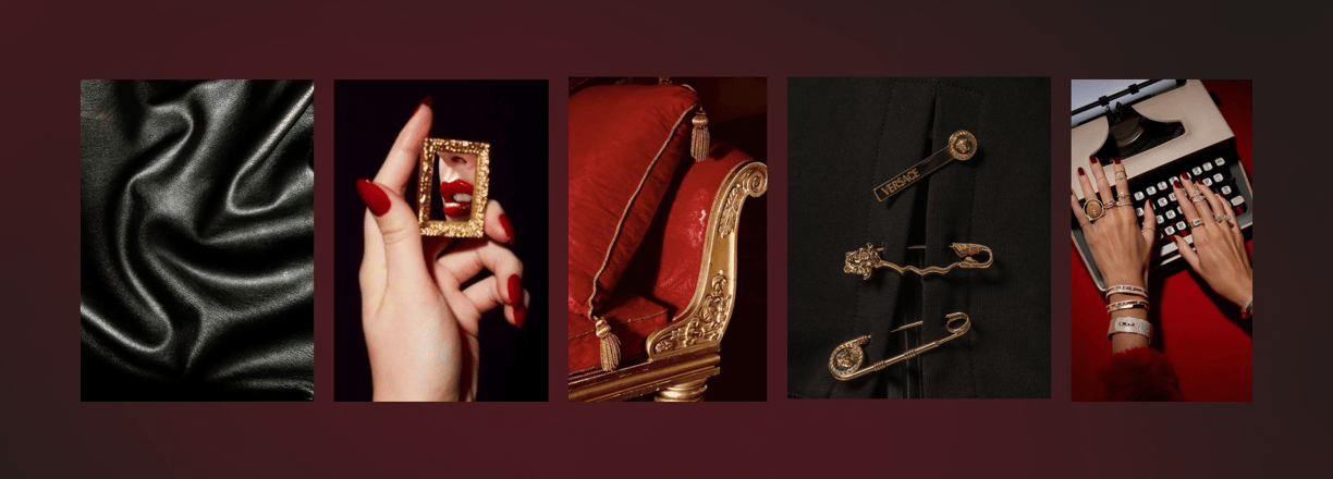
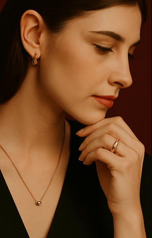
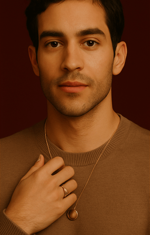
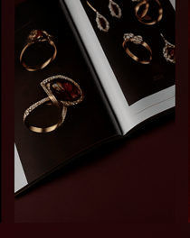
Visual Inspiration
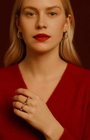
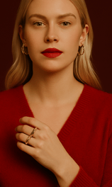
This moodboard was created to establish the visual tone and emotional atmosphere of the Lustra brand. The imagery reflects the world the app exists in—elegant yet daring, timeless yet modern, with a distinct sense of powerful femininity and sensual detail.
The Problem
Online jewelry shopping can be overwhelming due to:
Cluttered product layouts
Poor mobile optimization
Lack of emotional engagement
Limited filtering or customization tools
The challenge was to design an experience that feels refined, intuitive, and emotionally engaging across devices.
Target Audience
Young professionals (ages 25–40) looking for modern pieces or gifting options
Couples shopping for engagement or anniversary pieces
Style-conscious individuals who value aesthetic design and quality craftsmanship
Gifting shoppers who need guidance, inspiration, or personalization tools
Research & Discovery
Competitive Analysis
To understand the landscape of online jewelry shopping, I reviewed the following brands:
Key Takeaways:
Customers value story-driven layouts over aggressive sales tactics.
Clarity in customization, gifting, and size selection is essential.
Mobile-first design is crucial—most users browse on phones.
Brand
Strenghts
Weaknesses
Mejuri
Pandora
Tiffany & Co.
Clean UX, minimal design, strong storytelling
Strong gift features, good filtering
Luxury branding, strong use of whitespace and hierarchy
Limited product filtering; try-on UX is weak
Outdated UI; inconsistent mobile experience
Less intuitive for casual or gift-focused shoppers
User Personas

1. Clara – The Sentimental Gifter
Age: 31
Occupation: Marketing Manager
Goal: Buy a meaningful gift for her sister’s milestone birthday
Needs: Guidance, packaging options, emotional storytelling
Frustrations: Overwhelming layouts, unclear shipping timelines

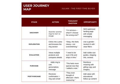
2. Julian – The First-Time Buyer
Age: 27
Occupation: Engineer
Goal: Purchase a promise ring for his partner
Needs: Size help, comparison tools, reassurance
Frustrations: Vague descriptions, lack of reviews or real-life imagery
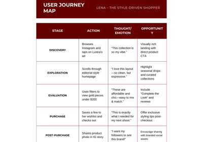
3. Lena – The Style-Driven Shopper
Age: 24
Occupation: Fashion Student
Goal: Explore new collections and trends
Needs: Visual inspiration, quick browsing, curated guides
Frustrations: Clunky navigation, visual overload
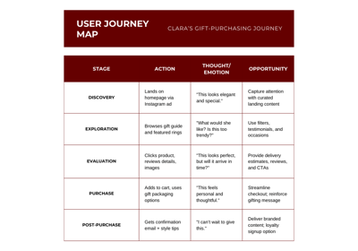
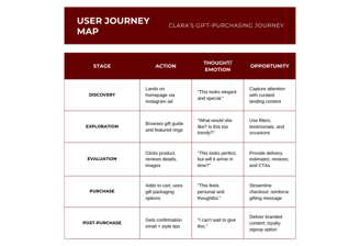
User Journey Mapping
Understanding our users was key to shaping Lustra’s experience. These journey maps highlight distinct shopping behaviors and needs.
CLARA'S GIFT PURCHASING JOURNEY
Clara’s flow is built around emotion and personalization. The gifting experience was designed to offer reassurance, memorable packaging, and ease of delivery—all while feeling luxurious and intentional.
JULIAN'S FIRST TIME PURCHASE
Julian’s journey focuses on trust, guidance, and clarity. UX decisions emphasize education, simple sizing, and clear policies—helping new users feel confident at every step.
Lena shops for self-expression. Her journey is visual-first, fast-moving, and inspired by editorial content. The interface responds with immersive visuals, lookbook highlights, and trend-led discovery tools.
LENA'S STYLE DRIVEN SHOPPING
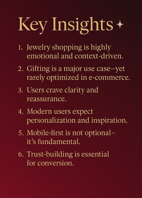
Key Insights
Through competitive analysis and detailed journey mapping of three diverse personas—Clara, Julian, and Lena—a number of recurring needs, expectations, and opportunities emerged. These insights shaped both the feature set and experience strategy for Lustra.
Jewelry shopping is highly emotional and context-driven.
Users aren’t just buying objects—they’re purchasing symbols of love, identity, or style. The experience must reflect that with a narrative-rich, emotionally intelligent UI.Gifting is a major use case—yet rarely optimized in e-commerce.
Clara and Julian both needed gifting features like custom messages, discreet packaging, delivery scheduling, and guidance on what to buy. This is a core opportunity for value creation and customer loyalty.Users crave clarity and reassurance.
Product specs, ring sizing, material details, return policies, and shipping timelines must be clear, accessible, and visually organized. Ambiguity leads to hesitation and cart abandonment.Modern users expect personalization and inspiration.
Lena represents a growing user group that browses for aesthetic discovery. Curated content, editorial styling, “Complete the Look” sets, and seasonal guides support expressive, style-focused shopping.Mobile-first is not optional—it’s fundamental.
All three journeys begin on mobile—whether through social media or search. The interface must prioritize thumb-friendly navigation, concise content, and fast load times.Trust-building is essential for conversion.
Jewelry is a higher-consideration purchase. To instill confidence, the app needs credible photography, real user reviews, social proof, care instructions, and a refined brand tone.
Lustra App Requirements
(Feature Summary Based on Journey Mapping)
Based on user needs and behaviors across all three personas, the app should include the following key features and elements:
Core Shopping Experience
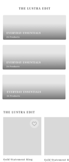
Mobile-first product grid with responsive scaling
Advanced filtering: category, material, size, price, style
Product detail pages with:
360° view / zoom-in on materials
Clear pricing, specs, and availability
“Complete the Look” or suggested pairings
Wishlist functionality
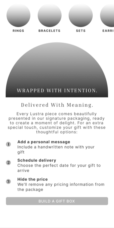
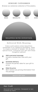
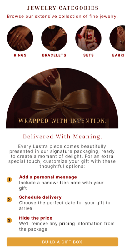
Gifting Features
Gift guides for occasions (birthdays, anniversaries, proposals)
“Send as Gift” checkout with:
Custom message entry
Optional price-hiding
Delivery scheduling
Gift wrap preview or packaging animation
Trust & Support Tools
Reviews with star ratings, user photos, and filters
Jewelry care instructions and ring sizing guide
Transparent return policy
Secure payment options (Klarna, Afterpay, PayPal)
FAQ and live chat support

Inspiration & Editorial
Homepage spotlighting seasonal collections and drops
Visual gift quiz (“Which piece fits her style?”)
Lookbook-style image browsing
Curated trend categories: minimalist, vintage, statement, etc.
Featured artist or maker profiles
User Accounts & Aftercare
Save items to wishlist
Order history & delivery tracking
Style tips or pairing recommendations post-purchase
Loyalty or referral program (optional future phase)
Visual Identity & Style Guide
✦ Typography System
Lustra’s typography evokes sophistication while ensuring high readability across platforms.
Inria Serif is used for headlines and product captions, bringing a sense of editorial elegance.
Inter balances the layout with clean, modern body text and UI labels for effortless legibility.
Sizes and weights were thoughtfully scaled for both desktop and mobile to ensure consistency in tone and hierarchy.
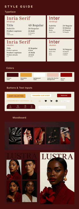

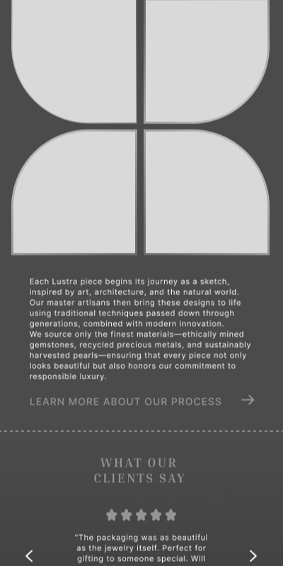
To ensure the Lustra experience felt cohesive, elegant, and emotionally rich, I developed a brand identity system that translates across both desktop and mobile environments. Every element (from typography to button styling) was selected to balance luxury aesthetics with clarity and usability.
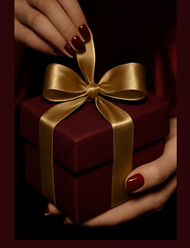
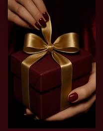
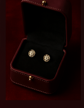
✦ Color Palette
The palette draws from rich, tactile materials like velvet, silk, and gold. These hues ground the interface in luxury while providing a strong visual contrast for buttons and key CTAs.
Primary: Deep burgundy, representing warmth, intimacy, and richness
Secondary: Buttery gold, used for highlights and accents
Neutrals: Creams and ivories for backgrounds and support sections
Accent: Crimson red used selectively to draw attention to actions or details
✦ Buttons & UI Elements
Call-to-actions are styled to feel bold yet graceful, using gold fills and soft shadows. Button hierarchy is clear: primary actions like “Shop Collection” stand out, while secondary links retain elegance through fine lines and type-only styles.
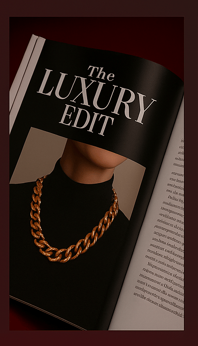
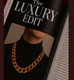
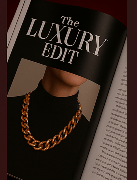
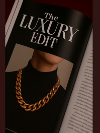
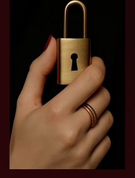
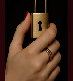
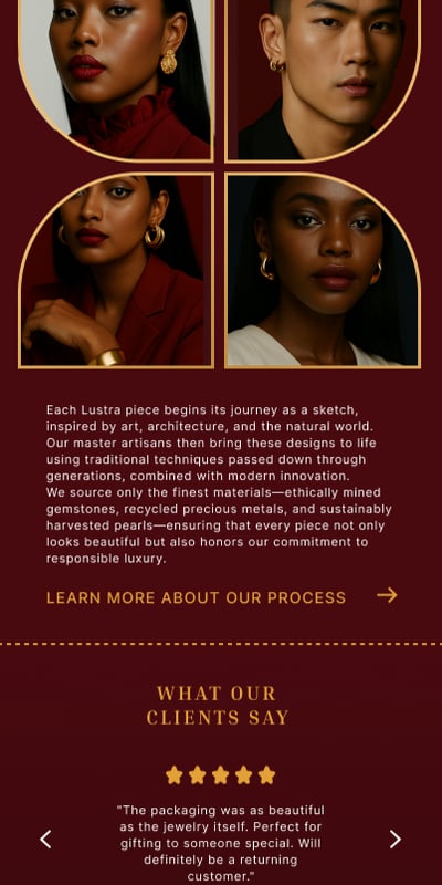
✦ Moodboard
The visual direction was built around an atmosphere of modern glamour and heritage opulence. From satin textures and gold accents to expressive portraits and crimson textiles, the moodboard informed every stylistic decision—from photography tone to UI spacing.
Key visual themes:
Bold, empowered femininity
Statement gold jewelry
Editorial-inspired lighting and framing
A rich balance of minimalism and decadence
Wireframes & Structure
Before diving into visual polish, I created low-fidelity wireframes to focus on functionality, flow, and hierarchy. The priority was to ensure the app’s structure supported both emotional storytelling and intuitive navigation.
Key Wireframe Highlights:
Homepage: Hero carousel, quick access to collections, gift guides, and editorial highlights
Product Detail: Clean layout with imagery first, followed by storytelling sections, specs, and recommendations
Gifting Flow: Optional gift toggles, personalized messages, and scheduled delivery
Checkout: Minimalist, one-page format with expandable sections for a seamless experience
Wishlist & Dashboard: User-centered design with clear access to orders, saved pieces, and ring sizing tools
Wireframing helped establish clarity before introducing the rich visual style, ensuring the design stayed usable and purpose-driven beneath the aesthetic layers.
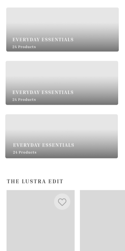
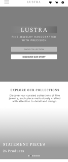
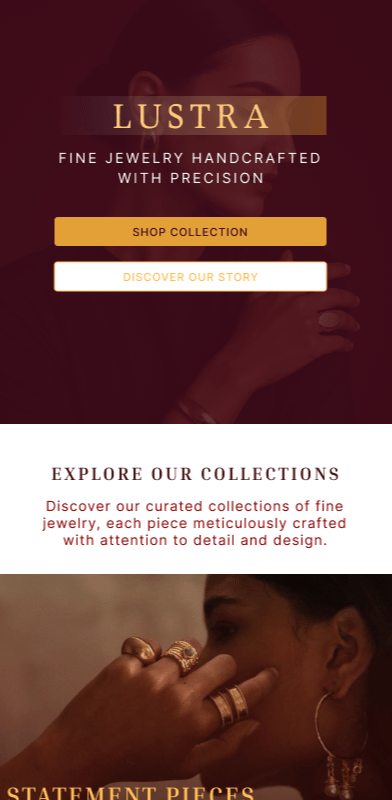
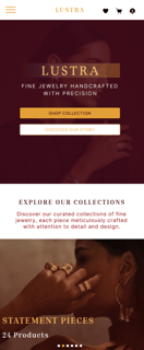
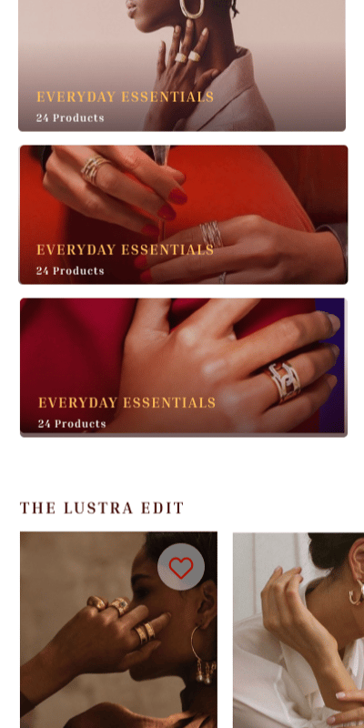
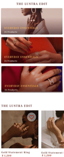
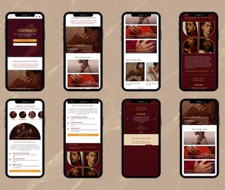
High-Fidelity Designs
The final UI design blends editorial elegance with luxury e-commerce standards. Each screen was created to reflect the tone set by the moodboard: confident, tactile, emotionally rich.
Visual Highlights:
Soft color gradients with bold contrast for call-to-action elements
Elegant serif headings paired with subtle, readable body type
Custom iconography and button styling to reinforce the jewelry concept
Art-directed photography frames and subtle movement on hover states
Mobile-first design with thoughtful scaling, spacing, and touch behaviors
Each interaction was designed to evoke the care and attention to detail that fine jewelry itself represents.
Conclusion & Reflection
Lustra was a deeply rewarding exploration of how digital products can express emotion, beauty, and practicality at once. Through a blend of UX strategy, aesthetic exploration, and functional depth, I created a jewelry shopping experience that’s both beautiful and truly user-focused.
What I Learned:
The power of emotion-led UX in luxury e-commerce
How to design for multiple user types with different goals
The importance of clarity, confidence, and storytelling in product presentation
How to translate abstract visual themes into interactive systems
Balancing editorial beauty with usability
Final Deliverables
Mobile and Desktop Homepage UI (Figma)
Responsive component system (buttons, cards, inputs, nav)
Style Guide: Color palette, typography, iconography, buttons
Presentation mockups (mobile + desktop)
Promotional thumbnail and case study graphics
Brand color & type system
Wireframes and user flow map
Moodboard & visual direction
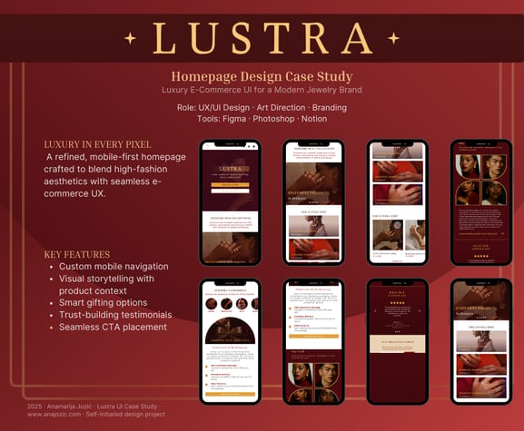
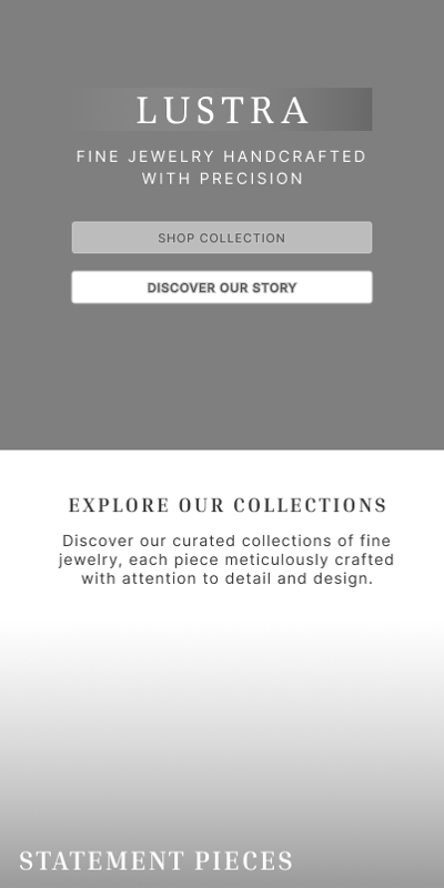
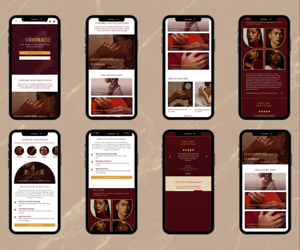
The initial design focus was placed on crafting a mobile-first experience, ensuring clarity, elegance, and accessibility on smaller screens. From product discovery to gifting flows and storytelling elements, each section was optimized for touch interaction and vertical scrolling.
Custom mobile navigation with icon-based shortcuts
Gesture-friendly carousels and clean content stacking
High-contrast CTAs and scalable text styles
Seamless gifting and checkout interaction


Desktop Expansion
After finalizing the mobile flow, I extended the design into a responsive desktop version, adapting the layout and hierarchy to suit larger screen behavior. Key considerations included:
Enhanced multi-column layouts for product grids and testimonials
Larger-scale visuals to emphasize the editorial aesthetic
Left-right content splits to support storytelling
Consistent typography and spacing across breakpoints
This allowed the brand experience to translate effortlessly across devices while preserving Lustra’s tone of voice and luxury feel.
Reflections
Designing Lustra was more than just an exercise in layout and polish—it was an exploration of emotion, elegance, and user empathy.
This project challenged me to balance aesthetic storytelling with strategic design thinking, while also honoring the feeling of luxury through every interaction.
I’m proud of how it came together but I do think some adjustments or layout redesign is in order. Esepecialy when it ocmes to visual try on functions and further enhancements of the design.
✨ Thanks for scrolling ✨